PRINT AD-PIZZA HUT

Standard

Hi, guys!

I hope everyone is well. I know it has been some time since I last posted for you guys. Honestly, it is really the effort and persistence and patience that is required to do something organic and of your own from scratch. I am only human so some time back I did give in to the vices, but here I am now!

Excited to share our AD POST OF THE WEEK. This was by Pizza Hut Middle East. They had marketed these massive leaflets with Khaleej Times newspaper.

I am not very sure if you can see how massive the leaflet is in the photograph above. The reason it deserves a mention on our blog is that it’s unique and quirky. It is eye-catchy and stands out. So it excites the reader’s curiosity as to what is this leaflet about. The image of the pizza is almost life-size, like for 6-8 persons.

It really gets the reader tempted as it looks so real like you are about to eat a hot cheesy slice right now! At that moment, the reader has only 1 thought in their mind, it’s Pizza Hut Time!

It is a creative yet simple tactic, but it is effective. The image itself looks so tempting, the reader is bound to place an order at Pizza Hut, to enjoy a slice and share a fun moment with their loved ones/work colleagues.

Simple brand strategy to connect with their customers and create more memories with Pizza Hut. All the important details are given such as the brand name, where to order, other dishes to add on to the meal etc.

After all, it is Pizza Hut, a place where families have been coming to celebrate for years, creating memories and happiness. It is a credible and trusted family brand serving fine quality pizzas and more.

Another way they could use the leaflet would be instead of keeping half the pizza image open to the reader, completely conceal the image in the leaflet. Once you open the leaflet, it unfolds itself, like a plate of pizza being magically created in front of you, similar to children’s storybooks; characters and surroundings open up when you open the book and fold when you close the book.

This was one of the ideas I had.You are most welcome to share your ideas and your creativity 🙂  Also, don’t forget to Share your love ❤ 🙂

PRINT AD-IMPERIAL JEWELERS

Standard

Bonjour Mes Amis! Tu vas bien? Hello folks, how are you?

As you can see, I am trying my hands on learning French. So far so good eh? Or should I say jusqu’ici tout va bien. I know it has been some time since I shared my ideas and thoughts with you guys, I havent exactly been feeling really well, mentally, emotionally and physically. Changing weather allergies, keeping the positivity and motivation up and running everyday especially when you are surrounded with the opposite of that.

Honestly, with all things that money can buy, I would really like to buy a life manual or a troubleshooting manual for life. I’m sure it would sell faster than hot cakes or croissants whatever you fancy 😛 Moving on.

Our AD POST of this week, is a Print Advertisement by Imperial Jewelers. The double page spread was in Cosmopolitan India magazine. It was printed for the May 2016 issue of the magazine.

The reason the advert has made it to our blog is because it’s so beautiful, everything is so beautiful about it.Firstly you have Diya Mirza, the Bollywood Actress as the model for the AD. Her look for this particular AD speaks of elegance, beauty, grace, feminity, simplicity and royalty.

On the second page you have the text ‘I am Dhairya-The patience to hold on’.Dhairya means patience in Hindi. It is also written in Hindi in the background. The imagery and text come together as a whole story rather than sub-parts of a story.

You think of a woman who is beautiful and strong, inside & out to choose this brand of jewelry. Someone who is calm yet determined to be victorious through the struggles of life. Someone who has a delicate face but she has this powerful strength in her eyes, which would make anybody think twice before they try to mess with her.

This collection of the brand is for the simple yet fierce woman of today. She has a mind of her own and is sort of like a rebel, doesn’t sacrifice her trueself for how society/media would like to see her as (flamboyant, pretentious, vain etc.).

The color scheme used compliment with the brand messages as well as the product (i.e the extremely beautiful choker necklace and earrings). Artistic paintings, vintage mirrors speak of regal elegance.

I also love the piece of jewelry that has been selected for this AD.It enhances Diya Mirza’s beauty with this simplistic design, it is not overly flamboyant in the way that it hides the woman’s natural beauty.

She is wearing white and the colour signifies peace and positivity and purity.  I absolutely love how the AD communicates modesty, strength, beauty and confidence so effortlessly. I am sure, many women like me would connect to the brand as we share similar values.

The name of the company itself, Imperial-Since 9 generations, conveys credibility and trust to the customers as it is an established successful business with family values at its core. They have got the ‘Call To Action’ and the mandatory information on point too. The phone numbers, website and social media pages are mentioned to not miss out on the instant connection with the customer.

So here you go guys, this is why I love this AD. Any creative ideas and thoughts are always welcome, you know that 😀

Share your ideas. Share your love.  ❤ 🙂

240_F_76192275_pBfZTQS6YUOJovctFgKsiiMNet8gLjy1

P.S. Credit for 2nd image-https://fr.fotolia.com/tag/%22%C3%A0%20bient%C3%B4t%22

McCAFE AD

Standard

Hey you. The awesome one. Yes, YOU!

How you doin 😀

Yes, I know it’s been some time since I posted an interesting review of an interesting advertisement. As you may already experience this yourself, there is a LOT of trash out there, when it comes to advertisements.

Finding simple, impactful, straight-forward Ads, that create meaning is a rare find. That is why after searching for a long time, I present to you, our first Ad post of the year. WOOHOO!

Or do I say AHA!( You know like the big idea moment) 😉

This was a newspaper print Ad. It was published in Khaleej Times newspaper, in the Nation’s section on the top left hand corner.

While skimming through I didn’t quite understand, what it meant. Then as everything else in the world, a closer look and I got the answers. Picture is totally worth a gazillion words in this matter.

Single most persuasive idea: Get yourself to McCafe, we got WiFi and freshly brewed coffee.

Now,who doesn’t love the sound of that?

Key messages could be: ‘good quality coffee now being served by your favourite family brand’. ‘Swipe on your day to a quick and delicious start.’ ‘Being an adult is hard, but we got you covered.’ or even ‘Mmmmornings with McCafe, I’m lovin it.’

I get the objective could be to create more awareness about the coffee that McCafe serves.  I love how simplistic and to the point it is.

The green swipe suggesting an app being switched on, on the smart phone.

The color green really stands out. The color stands for growth, life, energy, nature etc. In context to this Ad, it could mean, replenishing your energy with freshly brewed coffee. Awakening growth in you.

Green also subconsciously persuades you, that you are making the correct decision, in comparison to a red suggesting danger or stop. The placement of the coffee cup also emphasizes those persuasive ideas.

The brand logo at the bottom corner, tells you everything that you need to know in order for you to make the next purchase. McCafe is by Mcdonalds. An established and well-loved brand by families for generations, that makes it easy for the audience to believe in this Ad and this new product.

So guys, this is what I think about this Ad. Share your ideas would love to know if you agree with me or even disagree ( Yes, I am open to disagreements too-they lead to newer perspectives)

Share your creativity. Share your love.

🙂 ❤


VOLKSWAGEN AUTO AD

Standard

They say a picture is worth a 1000 words. Well for our AD post of the week, it does seem to be the case.

Hello Mi Compadres! I am talking about the advertisement by Volkswagen that I came across online. It could be a print advertisement, not sure about it, but I was amazed by it therefore it has made its appearance here on our blog 🙂

This AD according to me is one of those few simple but beautiful ads. This is truly that big ‘AHA’ idea that just magically appears after the brainstorming sessions are over. Simple but powerful and hard-hitting.

When the reader sees it, the eyes immediately go on the image. Power-packed and strong to say the least. A young couple/friends/siblings or even colleagues in the car dead or severely injured. Then you see the hand of the man as though holding a camera/selfie stick. You can see a car upside down in the background.  So automatically, a visual of the car crash is created in your mind and you can almost see/experience what must have happened. It gives the viewer jitters as suddenly it feels real and relatable. The copy below the image,’ Don’t selfie and drive.’ Just seals the deal.

The whole concept of a selfie has taken the world up by storm. At first it was a fun and cute concept, enjoyed by the self-lovers (as I call them), photography enthusiasts and people wanting to take entertaining pictures with friends and family.

As all things quirky and fun, there are users and there are abusers. Soon this almost narcissistic technique of taking innocent images was getting abused. People started taking selfies with and at the most inhumane and preposterous of situations.

Humans have started to risk their lives and lives of others, for a selfie, i.e. falling from buildings, doing adventurous stunts, sitting next to cheetahs and tigers, in between plane and car crashes, next to dead bodies of loved ones, it’s insane and ridiculous, you get it 😛

Keeping that in mind Volkswagen’s AD does full justice to the, (I can’t believe we are at that point in life) Anti-selfie campaign. It is amazing to see how it has moved from a quirky harmless concept to a dangerous and threatening one. I love how VW has elegantly addressed the problem through their AD messages.

I haven’t seen many brands talk about or campaign about anti-selfie or shall I say selfie-safety, so this AD seemed to be spot-on. Hard-hitting imagery, simple precise copy and brand logo, is all that is needed for a compelling AD from das brand (Das Auto, Das brand-get it 😀 )

If you guys know about other selfie campaigns and how have brands leveraged in on it, share thy ideas. Would love to know more about them or if you have any other ideas then, share thy creativity 🙂

P.S.- Lets not take a selfie and drive 😉

TITAN RAGA WATCHES

Standard

15327439_10154145198203030_6088522265233432502_n

15420922_10154145198163030_9216660750410745939_n

Here is the link for the TVC AD: https://www.youtube.com/watch?v=iS1A5rBAvjg&index=1&list=LLJttaLl7mptifAMDY6fmgGA

Hey everyone. Top of the afternoon to you!

It has been some time since I shared my favorite Ads with you guys on this blog. I was searching for an AD truly beautiful and strong in its message. Then I had my big ‘AHA’ moment 🙂

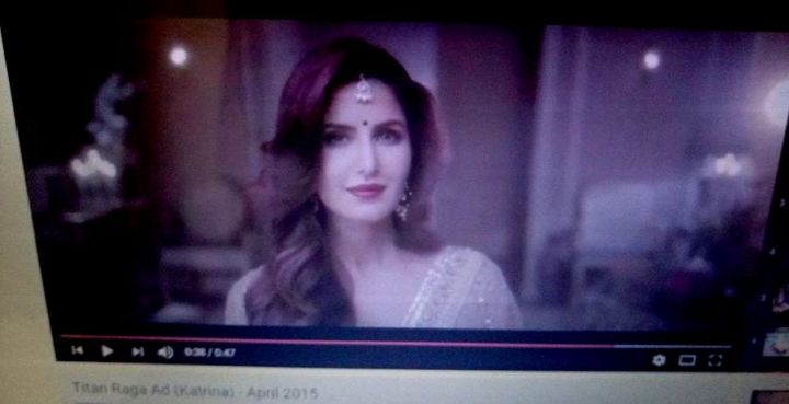
So our AD post of the week is about TITAN RAGA WATCHES. This is a Television (TVC)advertisement that was aired last year but on Indian Hindi channels.It aired during prime time shows on popular Indian TV channels. It featured the then brand ambassador for the brand, Katrina Kaif, Bollywood film heroine/actress, apparently it is another Bollywood actress now as the brand ambassador.

There have been many Ads before this by Titan Raga, though this one really caught my eyes and ears. This particular Raga brand is called the Garden of Eden Collection.

The story line of the TVC goes like this, Katrina Kaif is getting ready for a special event. There is a lot of hustle and bustle going on around her, as her friends and family(could be sisters) are around her, helping her get ready. Everyone looks beautiful in their Indian traditional clothes. Guests/relatives are coming around Katrina to talk to her, greet/congratulate her as it is her engagement party or wedding reception.

In the midst of all of this, she thinks to her self (but is indirectly talking to the target audience) the reasons why a person shouldn’t get married. I wouldn’t just limit these reasons to only being typically Indian, I think they apply to every single woman on planet earth.

The reasons to not get married she says are: just because your friends are getting married, or because you are tired of aunties’ questions(relatives/XYZ people questioning you or putting pressure on you to get married), or because you feel alone on Valentines Day, because your younger sister is also waiting in line to get married, or you would just get some company when you are old, or just because when will it be a good time to be a mother then , or because your ex-boyfriend is getting married.

The climax of the TVC is when she says,’When is the right time to get married? When you find someone who deserves your time. Titan Raga, a new relationship with yourself.’ In this scene, she applies the traditional bridal bindi on her forehead with a certain surety and confidence, suggesting she is empowered and happy in her choice.

This according to me is a beautiful, awe-inspiring, truly empowering ending to a really meaningful AD. To me this is beautiful story-telling. All your doubts, fears, anxieties answered and leaving you with a confident smile on your face and a brand new thinking of SELF-LOVE.

Love and respect yourself and your time by not Settling for Less than what you Deserve. For every woman out there seeking love and companionship, this AD is for you. Let go of whoever does not deserve a single minute of your precious time.

Titan Raga, an established brand of watches across India, conveys their beautiful messages  I.e-‘Beauty is precious so is time‘, ‘you are one of a kind‘, ‘Build a long-term relationship with yourself first‘, ‘one size does not fit all‘, through their product as well. The watch at the end of the AD is very unique, beautiful and elegant in its design. Butterflies,flowers with precious stones.

If you think about it, butterflies are generally associated with strength, change, hope and beauty. So you are looking at single, strong, independent educated women wearing Titan Raga to regain back their confidence in their choices in life and love. As a member of the target audience, this AD makes me believe in myself and my choices again. So when I would like to buy something for myself, that would make me happy, I would love to buy a Titan Raga as it makes me feel empowered and beautiful (Call to action).

So these are my thoughts, I wish more products and services have thought-provoking messages in their marketing material that really connects with the target audience and makes us brand loyal to them, rather than limit it to occasional buys only.

Do share your thoughts about such kinds of Advertisements or you have something different, I would love to know. Share your creativity.

Share your ideas.

🙂

TIPS & TOES SALOON

Standard

To my fellow Indians, Happy Belated Gandhi Jayanti. May we bring more wisdom and truth in our lives 🙂

And the rest of Mi Compadre’s! How is everyone? (see new word 😀  there is hope!)

So today’s advertising post is the Outdoor Advertisement, that I came across some time back for Tips & Toes Saloon Dubai. It is a popular women’s salon, with many branches in Dubai and Abu Dhabi to its credit. I will be discussing about the advertising I saw at the Business Bay branch.

As you are walking down the lane, you can see the salon has a big chunk of retail store space to itself. They have creatively used the 3 big walls/boards of their store space, into something really quirky and unique.

They make use of bright, attractive colours to catch attention. The use of white text on a colourful purple and red background really does grab attention. They are very easy on the eyes and have a subtle and sophisticated vibe about them.

The first wall/board is the entrance to the salon. They have their salon products on display, in the same colour theme of white on red. The other door is what catches my eye, the copy “Opening Time-Call 04” , the use of simple typography conveys their message.

The creative use of Bold Text format for the ‘hook‘ words,i.e.- Times, 7 Days, For and Call, really makes the difference to what the customer reads and remembers. So while passing by, the potential customer reads up the main details and if interested takes a note of it (Call to action).

The 2nd wall/board goes on the same theme as well, using white on purple and red. This is more informational, as they are letting their target audience know the name of the salon and their Unique Selling Point,i.e. “Home to the largest nail haven in the Middle East”.

Over here they establish trust, credibility and success to their brand, with the use of simple words and bold formatting(Reasons to believe).

It is beautiful, straight-forward and precise in its brand messages, just like the personality of their target audience.

The 3rd wall/board is what I love the most and it is actually what caught my attention. The photograph that I have taken is the 3rd wall.(you can see me in the mirror, well sort of 🙂 )

I have never come across salons/spas for men or women or even kids, to have a mirror as their advertisement tactic. It is smart, quirky and genius to say the least. So on one side, the services they offer are listed and on the other there is a beautiful mirror placed with the copy saying “Time for a touch up?”.

The text doesn’t separate itself from the mirror, they both work beautifully together as a strong message for the customer.

It really shows that the brand is thinking about their customers as they value and are concerned about them. When a woman sees the text, goes up to the mirror, checks herself out and says ‘you know what, I actually do need a touch up’ , the door to the salon is right open for her.

It serves like a reminder to her, to love and pamper herself maybe treat herself for a change, instead of waiting to be treated, very empowering in a way.

It is clear that the brand wants to pamper and spoil you and make you feel loved again and stop you from neglecting yourself.

I love how interactive and approachable this tactic is yet you don’t feel it is trying hard to sell you something. You go up to the mirror and say ‘I’m having a bad hair day, maybe a nice hot-oil therapy should do the job, do they have hair care services, oh well yeah they do, let me just go inside the salon and check it out.’ Boom success!

It connects with their customers on a very emotional level, leaving the customer feeling rejuvenated, happy and loved, like spending time with family or a group of friends.

I feel their key brand promise should work around this , ‘We care to care about you’. You know what would be even more interesting, if they had the same message and advert for a print women’s or lifestyle magazine, with the attached mirror and maybe a complimentary sachet of one of the brand’s salon products.

At least I haven’t come across something interactive and collaborative like that.

So this is what I felt about innovative outdoor advertising like this one. Would love to know more thoughts about this.

Share your ideas.

🙂


P.S-2nd image credit:http://bien.ae/wp-content/uploads/2016/06/IMG_1594.jpg

SHIBA RESTAURANT & BAR

Standard

Howdy guys. Hope everyone’s having an entertaining week.

Today we are going to be joining up the 2 most awesome topics, food and advertising,Yay!

This week’s ad post is about SHIBA Restaurant at The Meydan Hotel in Dubai.I came across this print advertisement in the WKND Lifestyle magazine. It was placed on the left side, a few pages further in the magazine.

The reason that this ad caught my eye, was because of its simplicity in its artwork. Through this ad, I can say SHIBAs’ brand personality is simple, fierce and bold. Making the use of the classic white text on black background , the text is precise and easy to read.

The image of the colorful food and plates and the way they are positioned, does become the focal point here. As when I look at it, immediately in my mind I can hear Kung Fu fighters and swords being swerved around in a duel.

I also remember the sequence between Master Shifu and Po in the movie Kung Fu Panda, when he trains him how to duel, while tempting him with food when all of a sudden all the dumplings are in the air. So the artwork is very imaginative, it gives the reader a slight preview to what’s in-store for them.

I like how the voice of this advert is sophisticated, straight-forward and yet so bold. This does not look like your regular Asian restaurant. The use of words ‘uniquely interactive dining experience’, tell me as a reader that SHIBA is a place to experience food rather than just eat.

The Art behind simplistic yet boldly expressive food, the experience of eating premium quality sushi in a beautiful and luxurious environment.

The location is at The Meydan Hotel, luxurious and beautiful of its kind. Thus one would expect everything in and around the vicinity to be of supreme quality.

The target audience includes guests staying at the Meydan Hotel, affluent men on their business or leisure trips, business men or women wanting to impress their international clientèle with the sophistication the place offers as well as foodies wanting to try a new experience.

The reservations contact number(call to action) is clearly placed on the bottom left corner along with the website of the hotel. Below that, the logo of the Global Hotel Alliance resonates that the hotel and the restaurant are highly respected and have credibility to their name.

I certainly believe that WKND magazine was not the best choice for a service advertisement like this one, maybe magazines such as  Grazia, Business Traveler or Emirates Man would have been more suited.

I love advertisements that communicate so much effortlessly, especially if its about food.

Enjoy . Share your ideas below would love to hear them.

🙂

CADBURY DAIRY MILK CHOCOLATE

Standard

TVC 1-Above link:https://www.youtube.com/watch?v=yICX_ZQ86Mw

TVC 2-Below link: https://www.youtube.com/watch?v=xqC6A4eVW28

cadbury 2

Hello world! Hope everyone is having a grand Monday.

So here I bring to you, yet another advertising post of the week. This is the Television Commercial(TVC) for Cadbury Dairy Milk India. The campaign was called ‘Badhti Dosti Ke Naam, Kuch Meetha Ho Jaaye’, basically meaning lets eat something sweet to celebrate the new friendship.

The commercial was broadcast at prime time, between popular TV shows, just when the whole family is sitting together.Cadbury Dairy Milk has always incorporated a beautiful story line to their advertisements. This particular one too, has 2 parts to it.

TVC 1– The story line involves a woman in her early 30’s standing in her balcony,enjoying the wedding happening in her neighborhood while eating a Cadbury chocolate. She feels at ease just before her mother-in-law enters the balcony. She gets conscious and changes her posture and wraps her sari up until her shoulder, to show her mother-in-law respect.

The awkwardness and the boundaries in the relationship are highlighted.When the daughter-in-law timidly offers a piece of the chocolate to the mother-in-law, she takes it and enjoys a bite of it. They look at each other and have a moment and smile at each other.

This leads to both of them dancing their saris’ off at the wedding happening under their building.They end up being the star performers at the wedding.The TVC ends with both of them leaving the wedding, like best friends/partners in crime ,being freed from their inhibitions and controls.

TVC 2– The story line of this one continues from its predecessor.It’s new years eve, the Cadbury Dairy Milk bar is shared with the family by the daughter-in-law. By the time she serves the chocolate to the mother-in-law, the chocolate bar is over.Right at the time of new years, the mother-in-law brings out another bar and they both wish each other and share a light moment dancing with each other in front of the whole family.

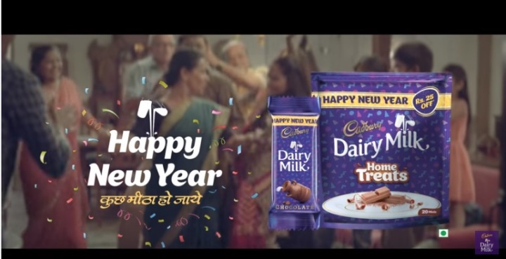
With the last scene being Cadbury Dairy Milk Chocolate Home Treats and New Years greetings with the tagline, ‘kuch meetha ho jaye’, meaning lets have something sweet.

The reason I love this campaign is because Cadbury has taken a fresh new approach to the mother-in-law and daughter-in-law relationship. In a country, where daily soaps/TV shows are famous to show fights between the evil mother-in-law and the dewy eyed, innocent daughter-in-law, this AD is as refreshing as a freshly squeezed chilled orange juice on a hot summer’s day.

Being an Indian woman, I have always been exposed to the idea that the mother-in-law is the ‘be all and end all’ to a relationship. There has always been a sense of negativity and awkwardness with that term.

To-be brides are always taught that you need to be extra nice to your mother-in-law and that you need to be at your best behavior when she is around,that includes respectful clothes, language (in this advert ,the daughter-in-law calls her ‘Mummyji’) I.e. just like a student in front of a principal.

I like Cadburys’ subtle rebelliousness in its key promise that it doesn’t have to be like this, in fact they can be the best of friends. Its the new approach to old relationships, to be filled with love and sweetness instead of fear and control.

The idea of the relationship to be based on friendship and support. It leaves the ad on a positive note to newer beginnings, possibilities and hope, which are great emotional reasons to believe in the ad, product, company and idea.

This ad focuses on the masses in India, the ‘middle class’.It intends to capture the hearts with a simple yet powerful concept.The product,the classic Cadbury Dairy Milk Chocolate has been showed in the TVC’s as being the essential reason to join the bonds between the characters, suggesting it is ‘the brand of chocolate for families’.

So when you go to the supermarket and you see a Cadbury bar on the aisle, instantly you have positive feelings towards the brand as it defines love, family, values, relationships and hope, which increases the customer loyalty towards the brand,much more valuable than a single purchase.

The second commercial is  reinforcing the ideas brought about by the first one. We are familiar with the characters, they are just like us, simple realistic ordinary people.So when we see them, we see a part of us in them, we attach emotions to them as they represent many of us.So if they can break traditions and live in a new way, why cant we ?

Please feel free to share your ideas, creativity is best when shared. Instead of having a sweet ending, here’s to sweet beginnings.

Share your love.

🙂


AL Rawabi Beverages

Standard

Hey guys! Hope everyone’s doing great.

As usual I was flipping through some magazines and I came across this ad and it captivated me in a second!

This is the print advertisement for AL Rawabi Beverages. It was placed in the Weekend Lifestyle magazine, somewhere in the middle of the articles.

The simplicity of the copy catches your attention. I like how they have used their 2 products from their brand portfolio and created the artwork around it. The quote a picture is worth a thousand words is represented beautifully here.

The creativity in the photography is commendable, as the lid of the Nutreeboost bottle is off and the top angle shot represents the morning sun or the time for suhoor.It is also well-placed at the top left hand corner. The angle of the lid of the laban bottle has been left half-opened to represent the crescent like shape of the moon.It is placed at the bottom right hand corner representing iftar evenings.

In the middle you have the text placed in a diagonal spread, suggesting the reader to continue with their healthy lifestyle in Ramadan by using AL Rawabi’s nutritional drink in the morning for energy and a lighter more refreshing drink by the evenings, followed by a bowl of dates, a staple snack doing Ramadan.

AL Rawabi is a trusted brand name, with heritage and values to their credit, that’s why the logo itself just makes the consumer recognise and believe the products on offer. The copy directly speaks to the reader, focusing on strengthening the relationship with the long-standing brand.

With that in mind, the target audience for this particular advert is fitness junkies, health-conscious, people on the go, the ones who are trying to fast in a healthy way rather than put on the extra pounds during Ramadan and Eid. Hence, the key messages reflect the same ideology.

It is a creative advertisement with a simple concept. The imagery is the strongest point to attract the reader/customer. Maybe they could have gone for the same text but not diagonally spread across and maybe use a white background against the Suhoor drink to represent mornings, it could have a stronger impact.

Hope you guys like my review. Share your thoughts below, will be happy to learn something new.

🙂

PRINT ADVERT: AL AIN WATER

Standard

Hello folks. Hope everyone is having a great weekend 🙂

So here I am with my first ADVERTISING post, actually the first of the many unique ADs that I will talk about here.

Considering the beautiful festival of Ramadan is going to start in Dubai, I am going to be talking about this ad which is by Al Ain Water, a product of the AGTHIA Food and Beverage Company. I came across this particular ad some time back but I always kept it with me because it was different.

It was a print ad published in the Weekend lifestyle magazine. What really caught my eye was its simplicity in its’ art and design. It would definitely catch your eye, as you are scrolling through the bright colours and design of the other contents of the magazine and all of a sudden there is a black background in front of you.

The eyes of the reader instantly go to the text. It is a simple, easy to read font,the classic white on black background.The italics on the font make the text look like words pulled out of religious books or manuscripts. The ad itself gives you a rather peaceful/calm vibe to it.

The messages are positive, inspiring and motivating. As only ‘ramadan kareem from al ain water’ is in blue, it is different from the rest of the copy, focusing your attention on the brand.

The brand creates a positive image in the reader’s mind with the way the copy is designed, as the brand name/product is not in your face, its subtle. It is only there to build the relationship, by wishing you and your family well.

The key image in this ad is of the young girl praying. It is a simple image though the angle in which it is taken in isn’t. It looks like she is praying, though she has water in her hands through which you can see the reflection of the moon, suggesting the brand’s water is so pure you can see a clear reflection of the moon. The focus of the image being on her hands.

I love how simply yet clearly they have communicated the messages, keep us in your prayers /we are with you in your prayers or our water is as pure as your devotion. It is the key promise that focuses on having purity in your thoughts, water etc.

At the top and bottom right side, you have the logos of the product and the brand for it. The Agthia logo reassures the consumer that the product is pure and safe as it suggests natural, organic, wholesome living. The Al Ain logo representing lush green mountains, blue skies and fresh waters with the help of the colors and illustration are also aligned accordingly.

The slogan for that particular ad ‘keeps you moving’ suggests a healthy lifestyle fueled by growth and success. I love this form of story-telling, where these mini chapters which come together to send out a beautiful uniformed message to the reader/consumer, which is subtle yet heart-warming.

You don’t quite need to show the product itself, as Al Ain Water is an established brand, which runs on its values of tradition, culture and heritage.The reasons to believe in this advertisement are both emotional and rational. The name Al Ain Water is easily recognizable as a quality brand, with a quality product so no introductions there.

As it is the holy month of Ramadan, Muslims as well as non-Muslims have a soul-cleanse, if I have to say, meaning positivity for the body and mind leads to positive actions. This is what the advertisement enforces in its images, typography, color and language. There is no major promotional aspect to this advertisement, more to do with restoring the confidence of the consumer with the brand.

So here goes, hope you guys like it and if you do have any other ideas or thoughts about this or any other similar ad you may have come across, let me know. It would be great to have a healthy discussion, it encourages creative thinking.

🙂